
As an Amazon Associate I earn from qualifying purchases.
This particular location
we flooded in October. This building was sitting atop this concrete structure with floodwaters
surrounding the building. Yeah, it looked like a houseboat. Yeah. So it was a pretty
breathtaking sort of image. The House is located in Rosebrook
on the outskirts of Port Fairy. It's in a beautiful floodway,
it was Gunditjmara land, and it sits in the ruins
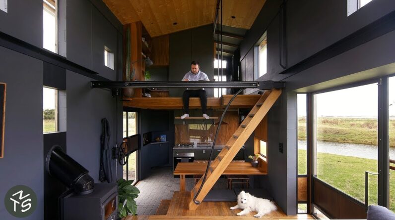
of an old flour mill. This house is nine meters
by roughly three point three meters, which gives it a total floor area
just under thirty square meters. With the mezzanine level, you get a total floor
area of forty square meters. It's designed with a fully offgrid
solar system with batteries and a backup generator.
And it's designed
largely to be a passive house. The road restrictions mean you can't transport anything on a freeway
that's over five meters tall. So that does restrict these buildings
somewhat to a certain ceiling height, which can make the spaces
feel a bit more cramped. That's why we designed this building
to have an expandable roof section. The way that this telescopic frame works
is the wall panels fold in on themselves and then the roof can be expanded
by operating a wheel . Which winds a cog system that pushes the whole roof structure
up by twelve hundred millimeters Then the panels fold back down
to complete your wall sections. The cyprus that we clad, the building in
are felled old cyprus windbreaks from local farmlands. They're
normally pushed into a pile and burnt. We decided to mill the timber
and clad our building in it. It created both a beautiful esthetic,
but also meant capturing a lot of carbon, which we thought was pretty important. We found the concrete slabs in a paddock.
Its original purpose
was to hold up cow troughs. But they seem perfect
as a floating staircase. We also scrounged metal mesh
from an abandoned pig shed. And the beauty of that is
that you can scrape your dirty boots off before entering the house. The design was intended
to feel like a New York style apartment that appropriate for a regional setting. The design also explores
the use of materials that have been recycled or restored. The double height of the lounge room
gives it an additional sense of space. The lower section is encased
by steel glass windows. The glass section of the living area juts out
from the rest of the building slightly. When you're sitting on the couch,
you're sitting more in nature pushes you out into the environment. Copper and ply louvers run horizontally
along those windows, giving the opportunity for ventilation
to come out through the building. We have pivot doors on the south
and western sides of the lounge room.
So in summertime, you can open
all the doors and have maximum airflow. The western side,
you can actually just sit on the ground and dangle your legs over the edge. The raised mezzanine
gave us an opportunity to capitalize on some extra storage, as well as separating the living area
from the kitchen area. And it gives you ample
storage under the floor for the things you don't use
on a daily basis. So the kitchen's got a two burner
gas cooktop, an extra sized sink, because the sink has to perform
a number of functions in a small area. It's got a relatively small
fridge and ample storage covers.
The above sink drying rack means
you're not wasting valuable bench space. You can put the dishes straight up
out of the way as soon as you wash them. The sliding door operates
as the bathroom door. But it reveals this
hidden storage component. We chose to use a glass splash back
so you can still see the beautiful texture
of the spoted gum and again. The pig mesh was used for some shelving
to bring in that rustic feel. The kitchen table has piano hinges that run along both sides for easy access. And just to alleviate some space
while you're working away at the kitchen. The ladder, which runs
to the mezzanine area, can be wound up using the same mechanism
that warns the roof up. So once you wind that ladder
out of your way, the dining space becomes much more ample. And the advantage
of having a raised living area is you can sit on that surface
at the dining table. We felt that the Home Office
was a very important aspect of any house
moving into the future. That's why Nick's design is really clever.
Home office space in the mezzanine that utilizes the space perfectly
because you can sit on the floor with your feet dangling
on this beautiful plinth and get amazing views
out of the windows at the same time. And then we decided
to put a bit of a bookcase easily accessible
to right there and chose to have a wall and a bookcase and a storage case
that broke up the office from the bedroom. The ridgeline of the roof
is shunted off center so that you could get this walkable space
through the mezzanine area. The bedroom has everything
you'd expect a wardrobe, a cupboard and drawers underneath the bed. We've got a mixture of fixed
glaxing and louvers in the bedroom. The fixed glazing
gives you an amazing view and the louvers create
excellent crossflow ventilation. The colors is still dark. To create that sense of the outside
is more important.
While also making
you feel very cozy. Yeah. In the bathroom,
we chose to go the bluestone cobble. These cobbles, they're basically offcuts from the factory that they tumble
and get these beautiful rounded edges. They make the bathroom feel quite luxurious,
but also very earthy and understated. It creates a very nice experience
when complemented with the slats of spotted
gum on the ceiling. The windows are pretty large,
so it makes you feel as if you're showering in the outdoors. For the shy, we've got these beautiful louvers
that you can then close and feel as if you're less exposed. We also used brass elements
that have been recycled for the handrail, toilet holders
and in the vanity area. Every surface you touched
and felt really made you feel like you were connecting
to an earthy sort of experience. The plumbing has a composting toilet
and a gray water retention system. The design philosophy of small
is that we just want to shift the attitude towards
living within your means. As we evolve as a community, we are going to understand that
bigger is not better in a small space.
Not only is it better for the environment, but it's also better for human interaction
and your interaction with the outdoors. Thanks for watching. To receive updates on our latest episodes, please subscribe
and click the notification bell. And if you're an architect or designer
with a project we could feature, please share it with us at
never too small dot com slash submissions..
As an Amazon Associate I earn from qualifying purchases.